Overview
Frisp makes dried fruit crisps sold in Australia and New Zealand, stocked in major supermarkets including Coles and Woolworths, and positioned as a healthier alternative to potato chips.
Bit of context
frisp.com.au, an Australian food brand focused on building healthy snacking habits in children, was going through a major rebrand. This project was part of a larger effort covering logo design, packaging design and strategy design. The first phases, logo and packaging, had already rolled out and were showing positive results with increased sales, so this case study picks up after them.
The design problem
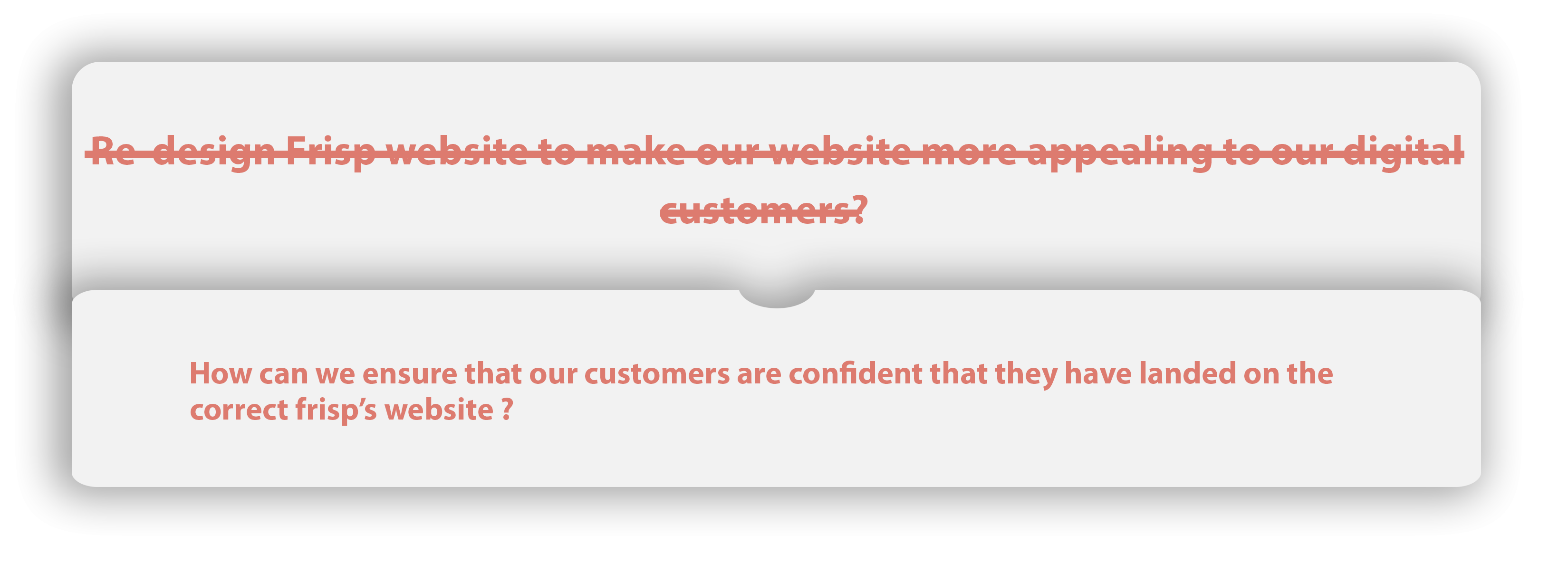
Redesign the Frisp website to make it more appealing to our digital customers. - Frisp marketing team
The rebrand was yielding good results, but despite an updated SEO strategy, AdWords and everything else being in order, the Frisp website still wasn't attracting customers. The marketing team simply wanted a redesign to make it more appealing. We knew the site had to reflect the new branding, but that alone wouldn't be enough.
Key goal
Design a website consistent with the physical rebrand, by first finding out why users weren't buying online.
Make-up of the team
I worked as the product designer throughout the design challenge, accompanied by a graphic designer and the marketing team. I produced all the deliverables in this case study and presented them to the client at every iteration.
Understanding the user
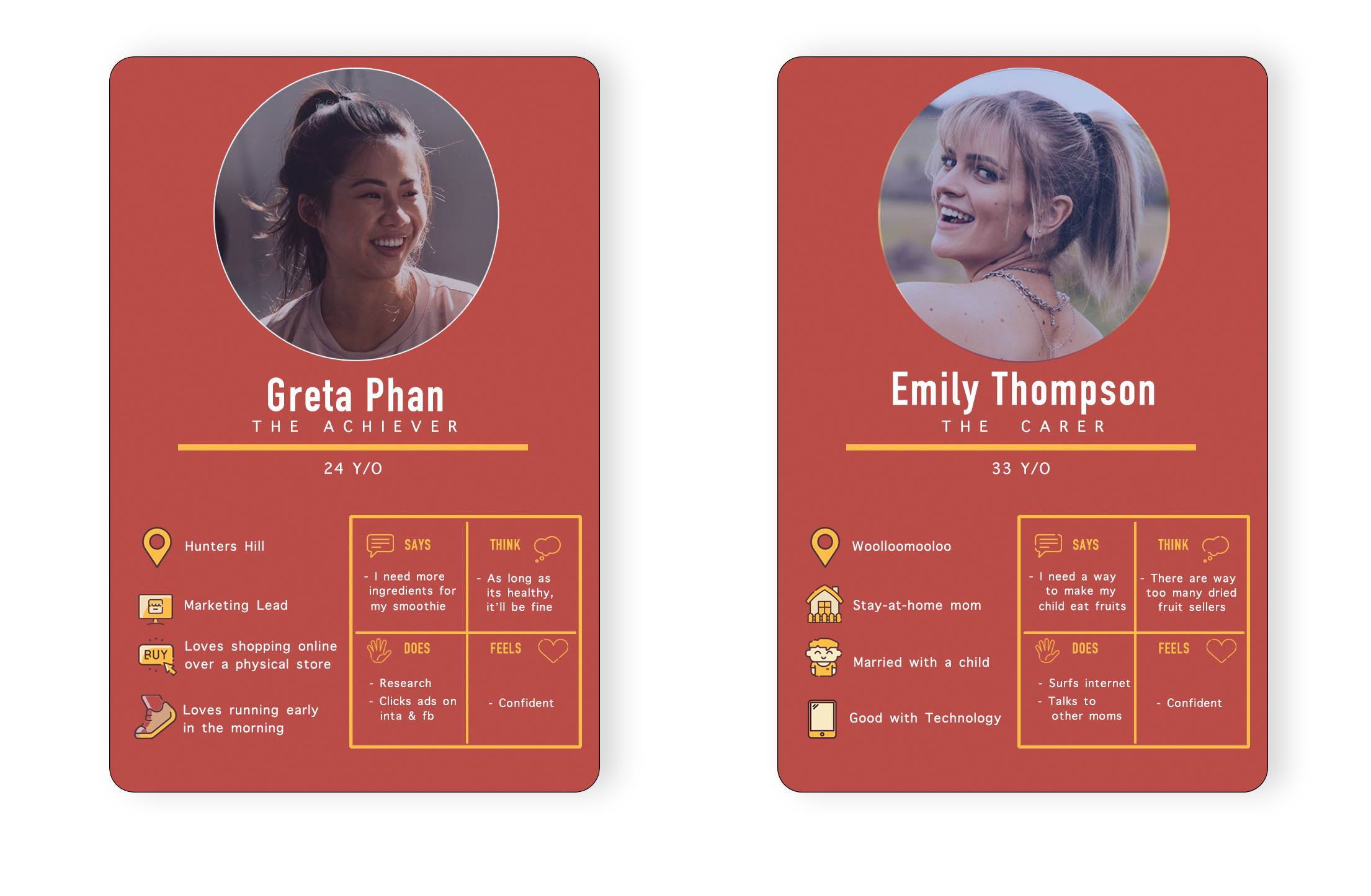
Supported by the physical rebrand of labels and sachets, it was clear we had two major user demographics. The Frisp marketing team had already run intensive research into their product and customers. They were confident the target group was children aged 8–14 and fitness enthusiasts, but that wouldn't necessarily translate to digital, because not many 8-to-14-year-olds buy products online without a credit card and parental supervision.
Bit of context
Our user research team helped us find a user group for the design exercise. Based on their data, the users of the Frisp website were aged 25–44: potentially the parents of those children, and fitness enthusiasts.
Initial observation: the user's perspective
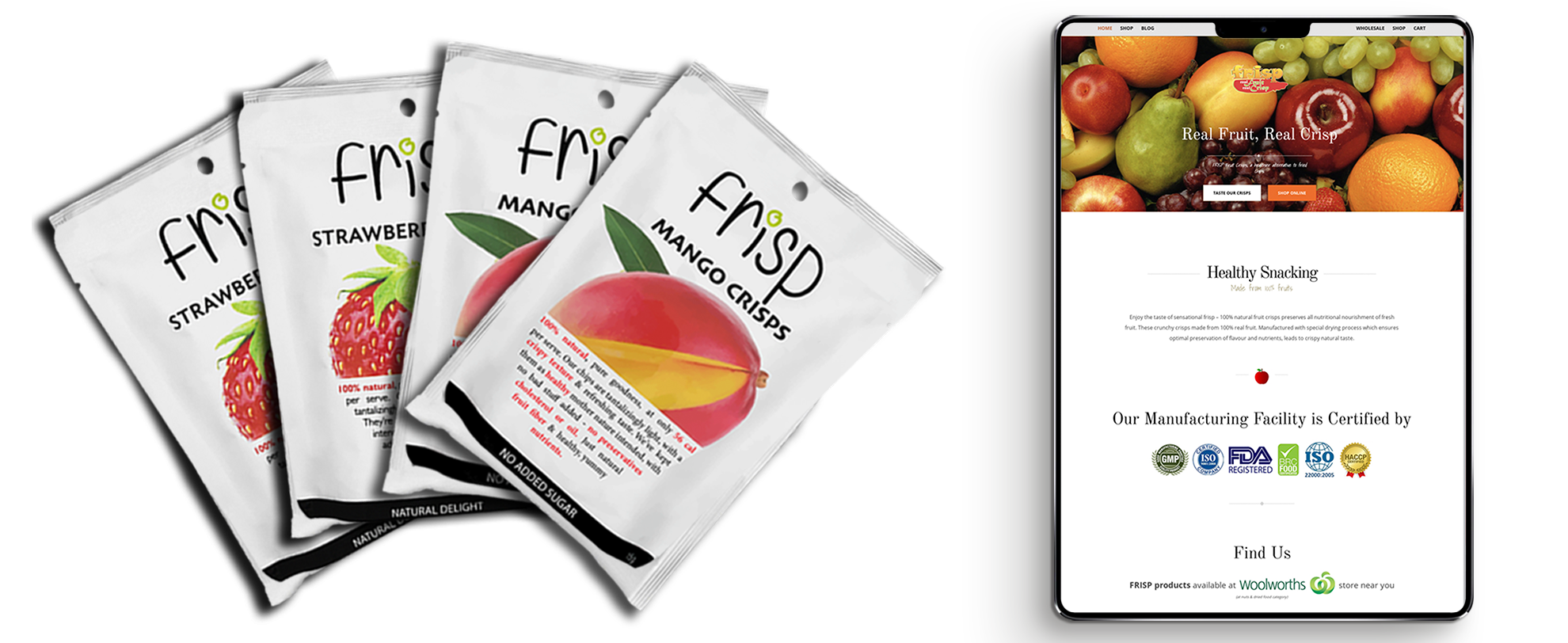
We had a few hypotheses about why the website wasn't working, but the main one was that users were unsure they had landed on the right page. That came from the extremely high bounce rate the marketing team shared. The look and feel of the actual product sachet looked nothing like the website, the logo was different, and there was no picture of the actual product anywhere on the landing page. During testing this hypothesis was validated with users, and it turned out to be true.
Detailed observation: the design perspective
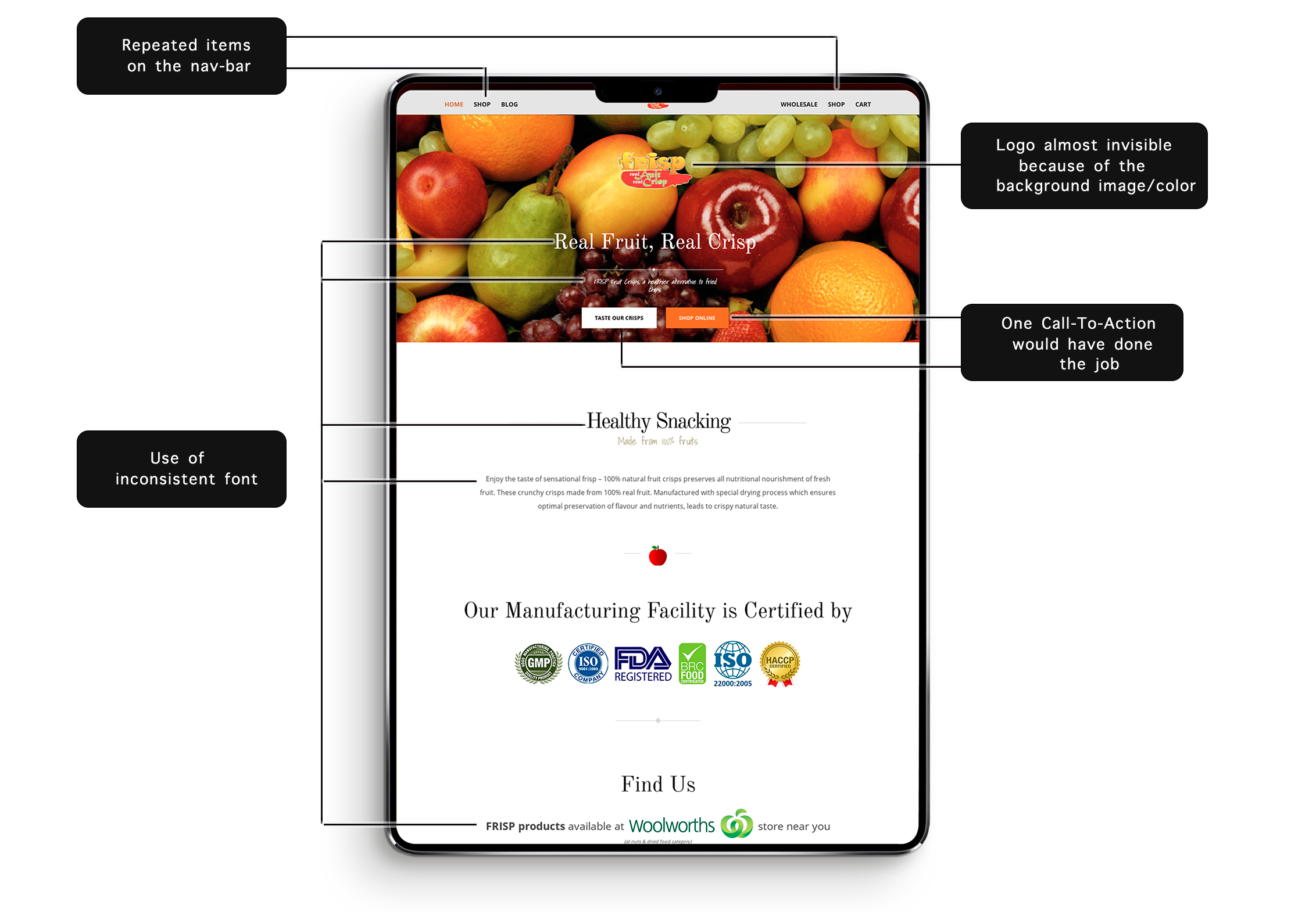
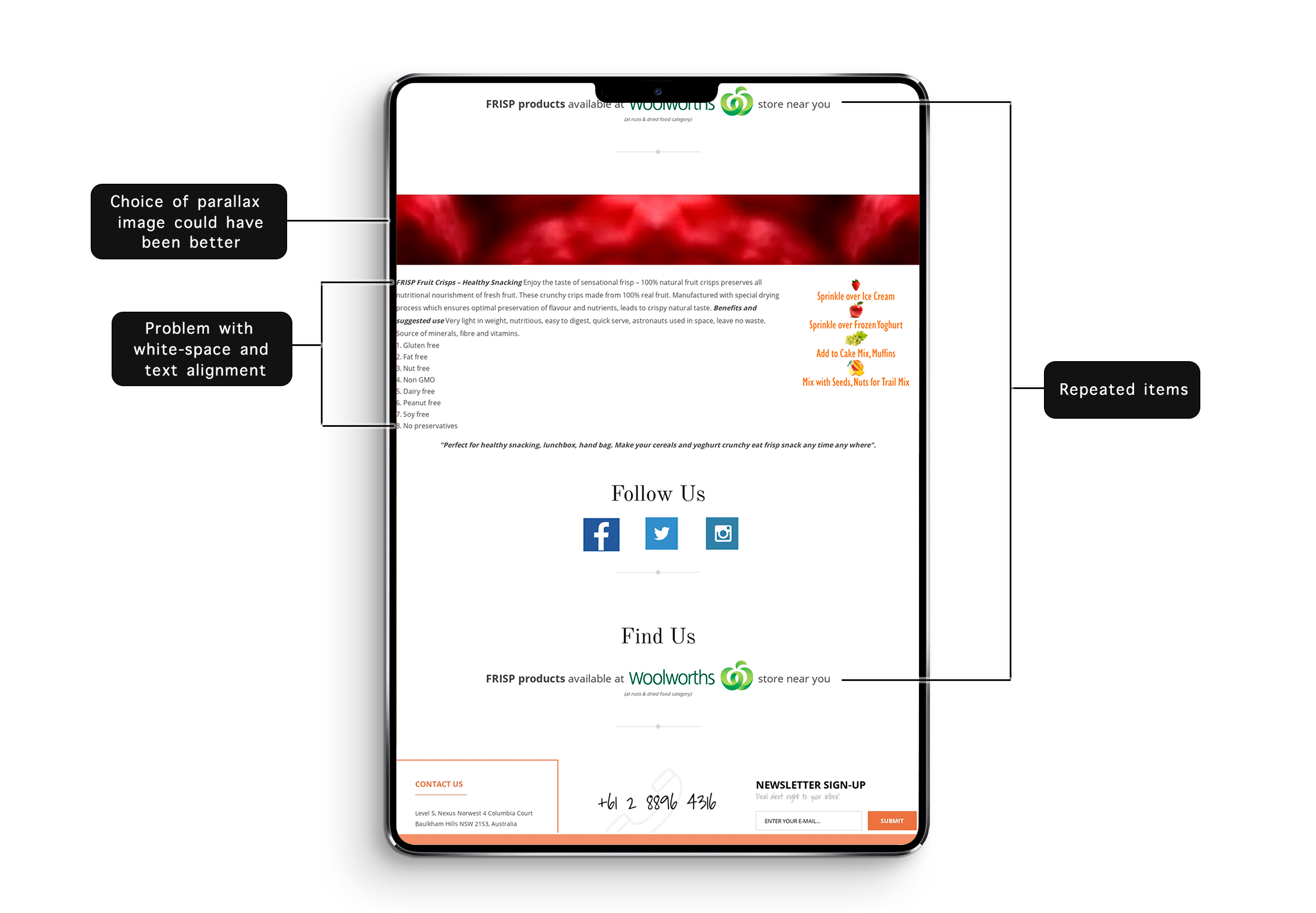
Next we looked at common design and usability flaws in the existing site. The point was to support the user researchers and to catch problems we shouldn't repeat in the redesign. We split the page into four sections: navbar, hero, content and footer, and reviewed each one.
Detailed observation: heuristic evaluation
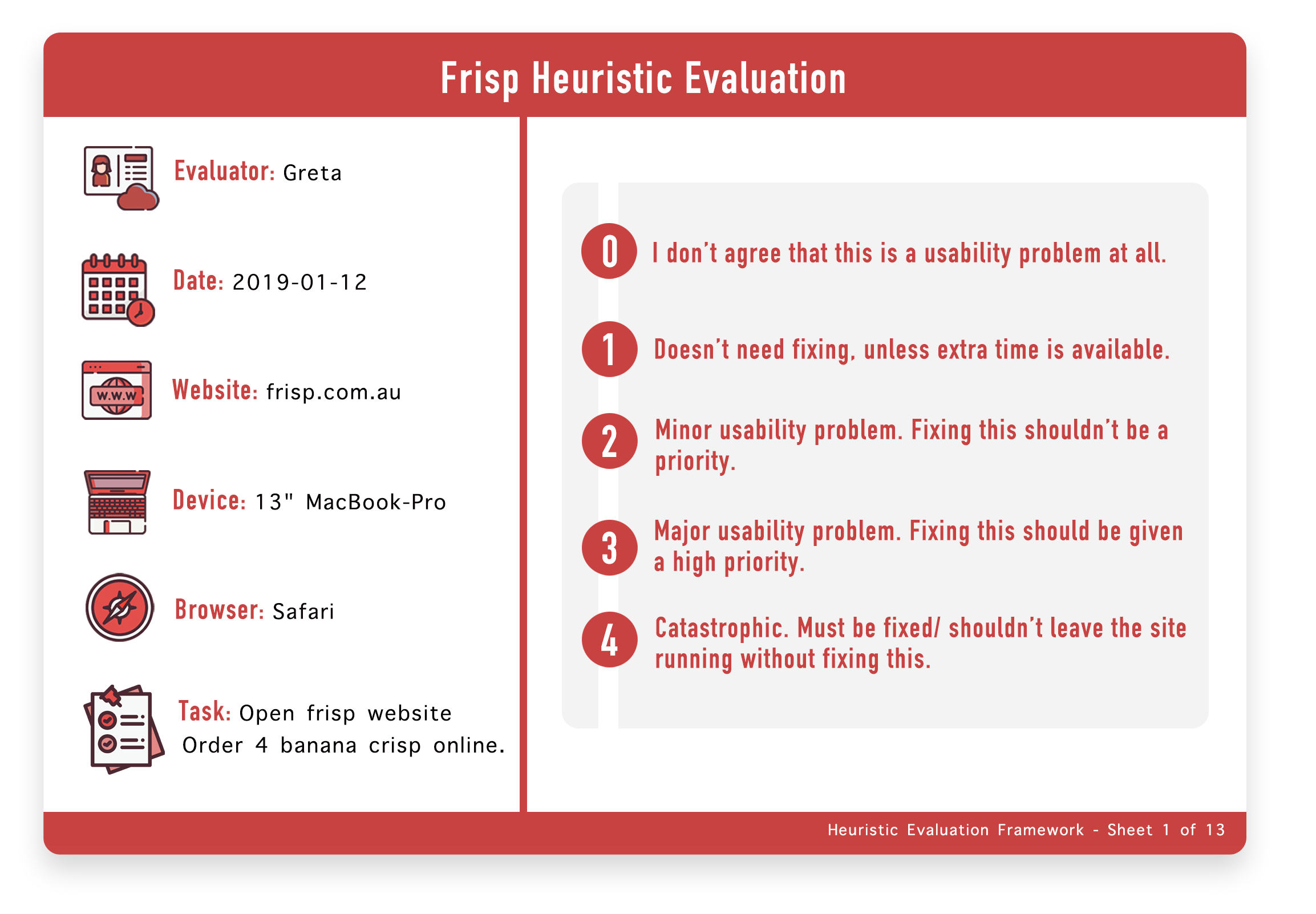
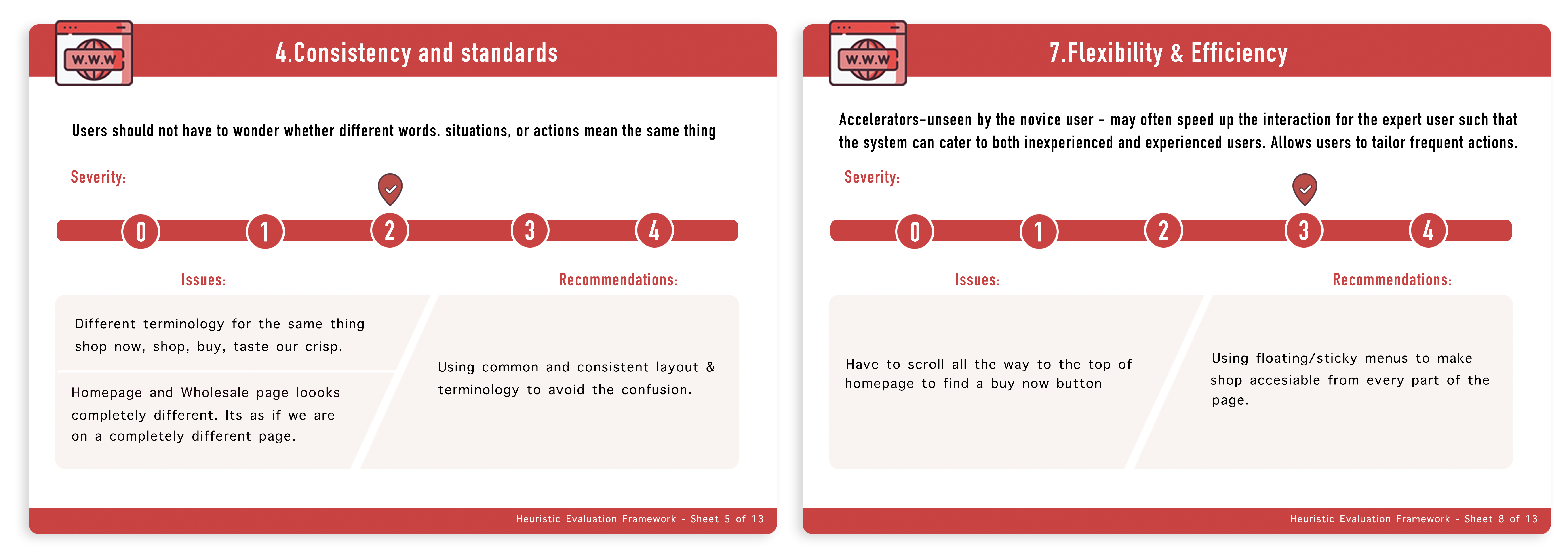
We ran a heuristic evaluation as part of usability testing on the old site, using Nielsen's heuristics as the guiding framework. We hired three evaluators matching our persona sheet and called each in at a different time of day, so they couldn't talk to each other and influence the results, and so an observer could watch one participant at a time. During the session evaluators shared their findings with the observer, who recorded them. There was no other communication between the two.
Note: evaluator names have been changed to protect confidentiality.
Main takeaways
- Way too many font styles, and inconsistent font choices.
- The colour combination of the hero image text and background image was hard to read.
- Ambiguous buttons, and multiple calls to action with the same function.
- No image of the actual product on the homepage, leaving visitors unsure they'd landed in the right place.
- Users had to scroll all the way back to the top of the page to navigate anywhere.
- The homepage, blog and wholesale pages looked completely different, so users weren't sure whether they were still on the same site.
Re-framing the problem
With all that data, we reframed the problem so that every time we were about to make a decision, we could hold the question in our heads and check whether the decision contributed to what we were trying to achieve.
Lo-fi prototype
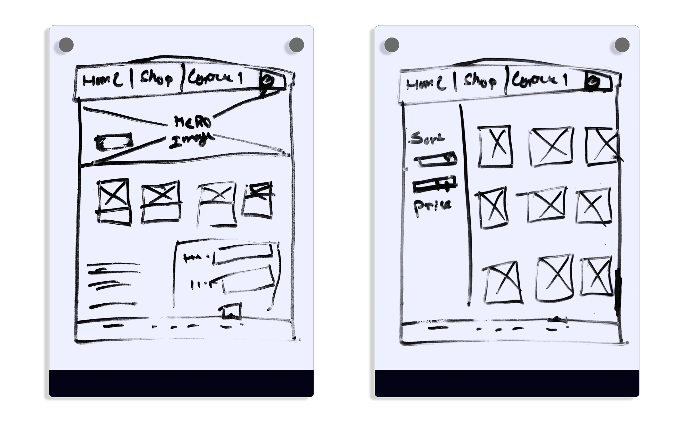
We started with lo-fi prototyping using a texter and a drawing board. We produced at least six sets of wireframes and chose the ones below. The point was to get the basic shape of the site down. We used no colour and left out components and detail so we wouldn't get attached to any one design, since we knew these would change enormously once visual design began.
Hi-fi prototype
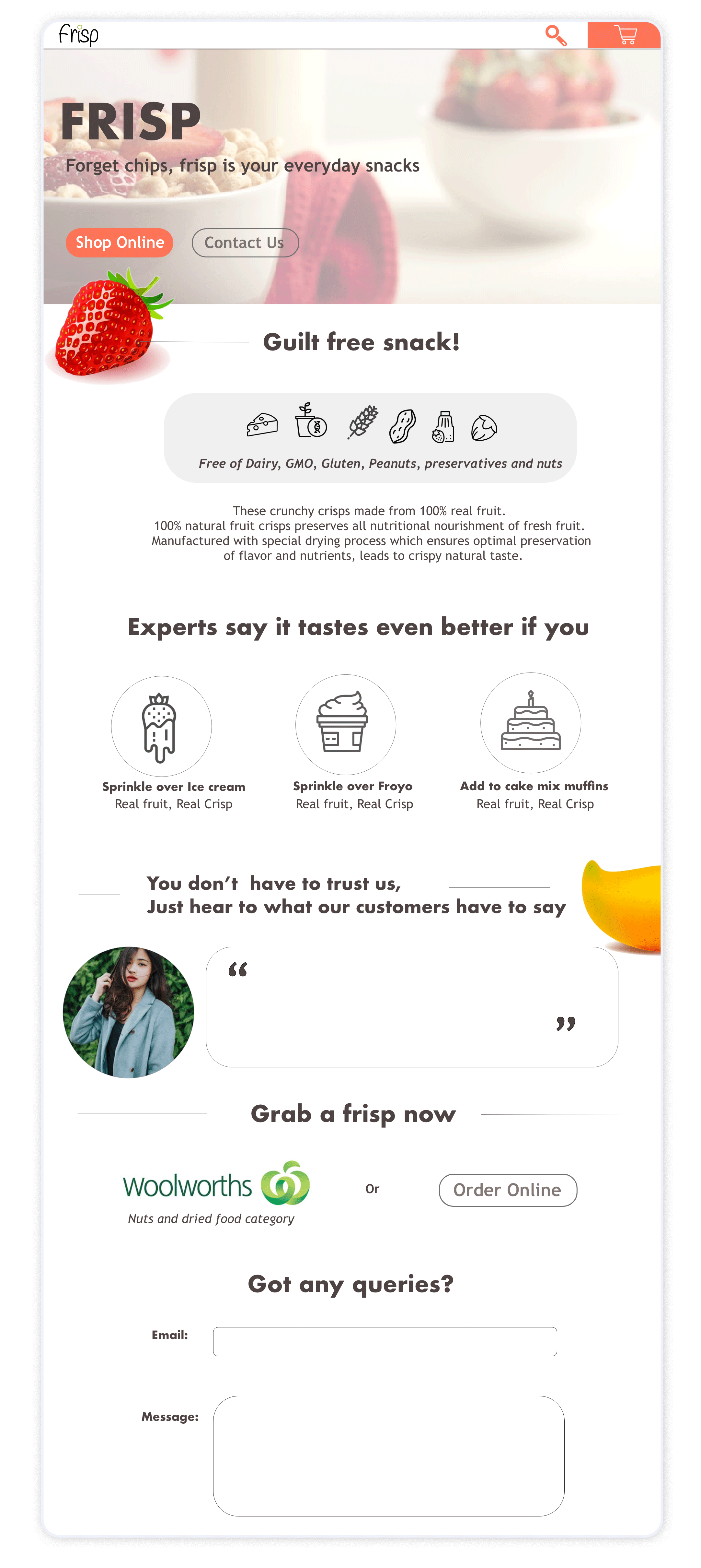
The lo-fi wireframes became mid-fi prototypes to get board approval, then a high-fidelity prototype. The image below is the first version.
Design system
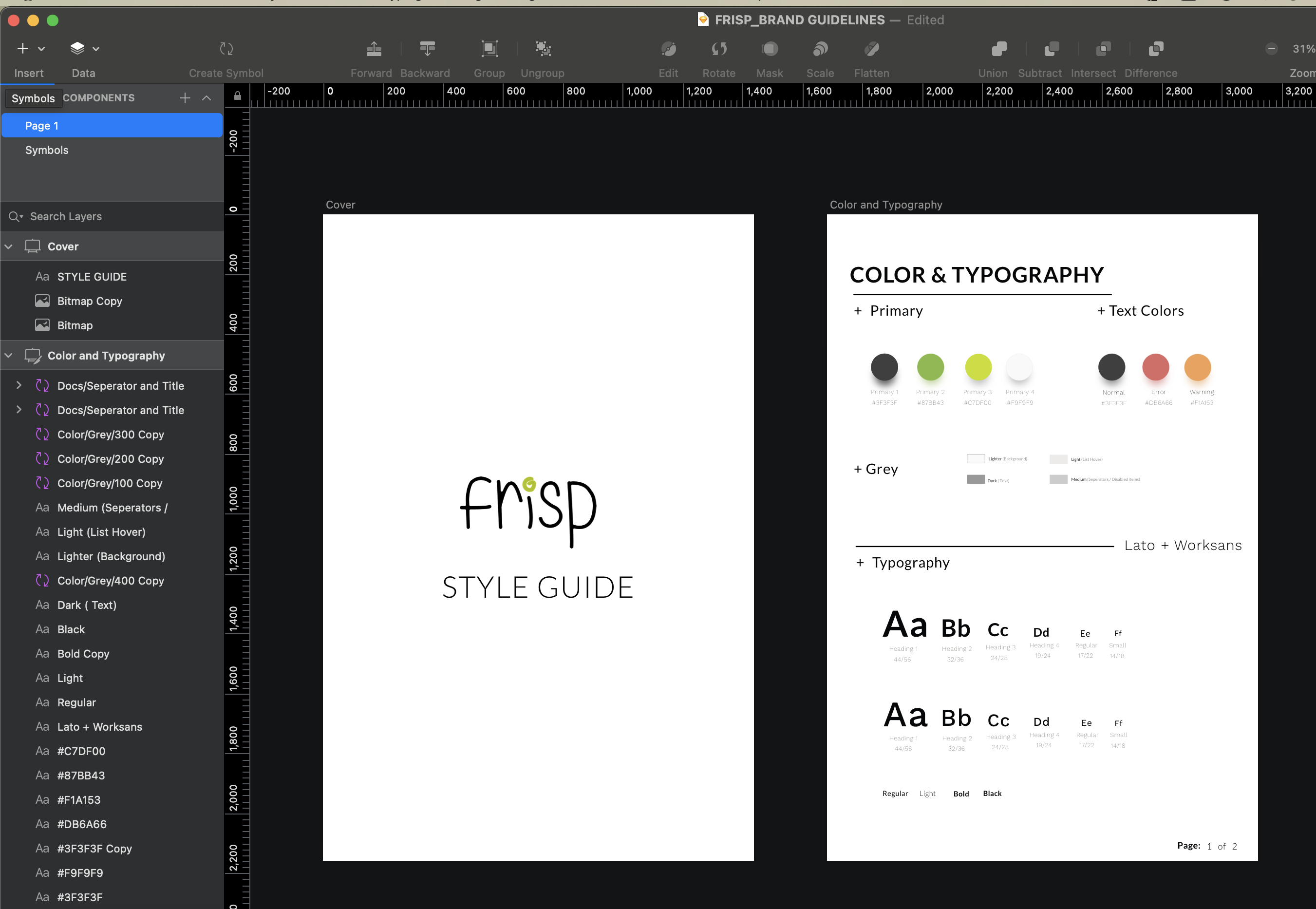
With one page done and some design consistency established, we needed a structure for rapid prototyping, so we built a design system. We made sure the components and symbols were nested, which kept them highly customisable.
User testing
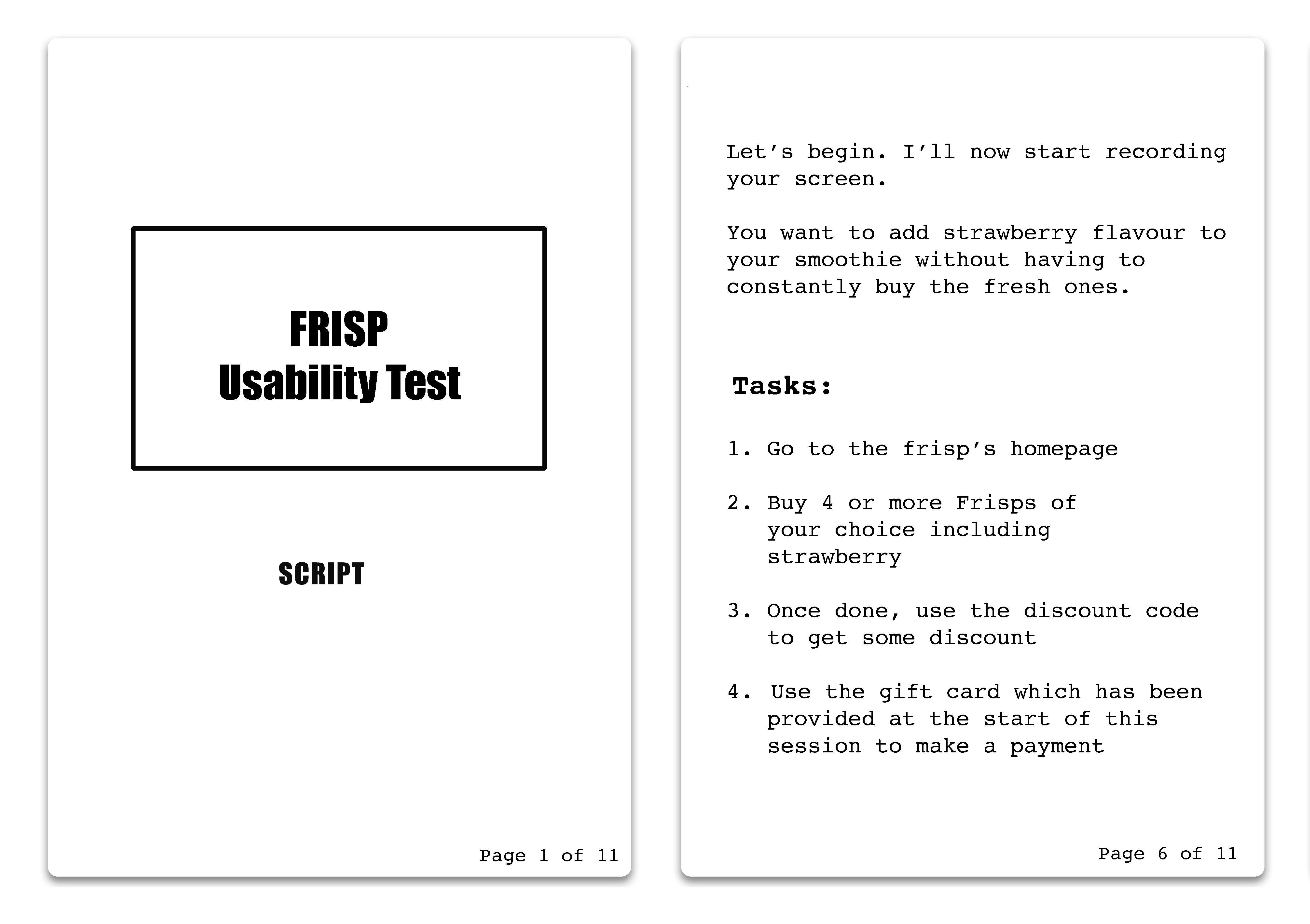
With the first iteration done, we ran a usability test with our first set of recruited users. Participants completed scenario-based tasks covering the main functions of the site. This phase was essential and drove the important decisions in the final design.
We noted where users struggled or seemed unsure of what they were doing. A short interview at the end of each session helped us work out what needed to change.
Key findings and changes
Sticky header
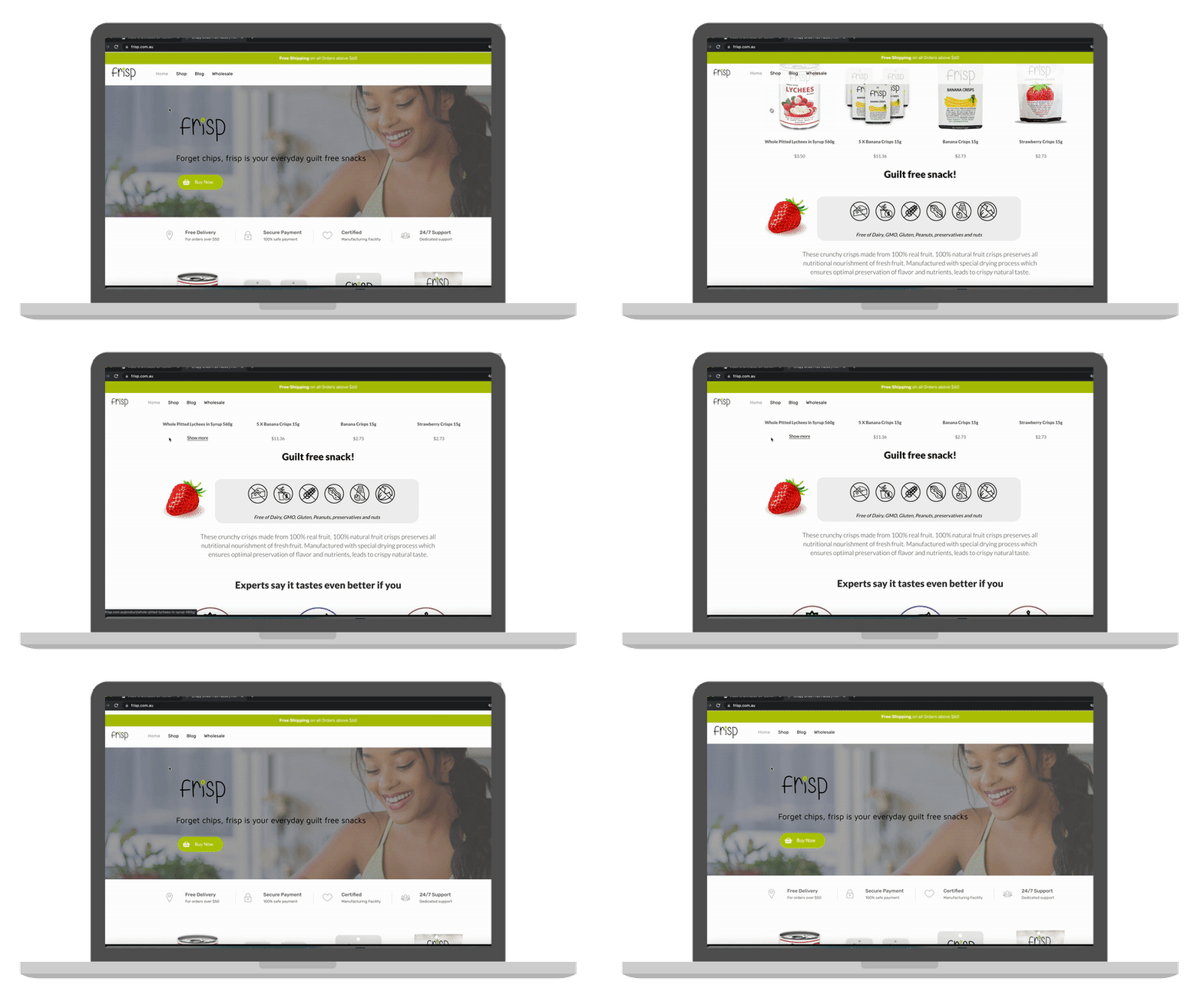
Despite Buy Now buttons everywhere, users kept scrolling back to the top of the page to use the menu. We changed the fixed header to a sticky one.
Wired buttons
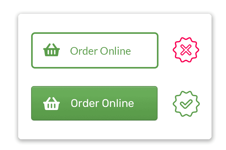
Users ignored the button right in front of them and used the banner to reach the shop page instead. After some discussion we realised they hadn't registered the existing button as a button at all, because it didn't look clickable.
Minor design changes
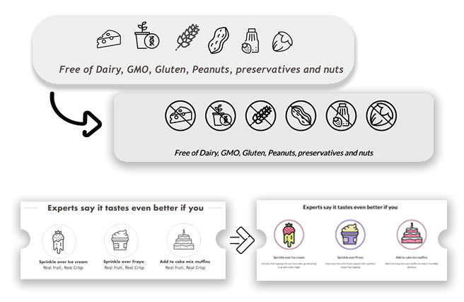
Questions raised during design review sessions included: the infographic looks like it's saying the product contains nuts and dairy, so shouldn't those be struck out? And how would it look if the plain black-and-white icons were colourful?
Final design
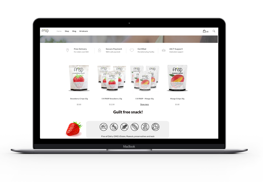
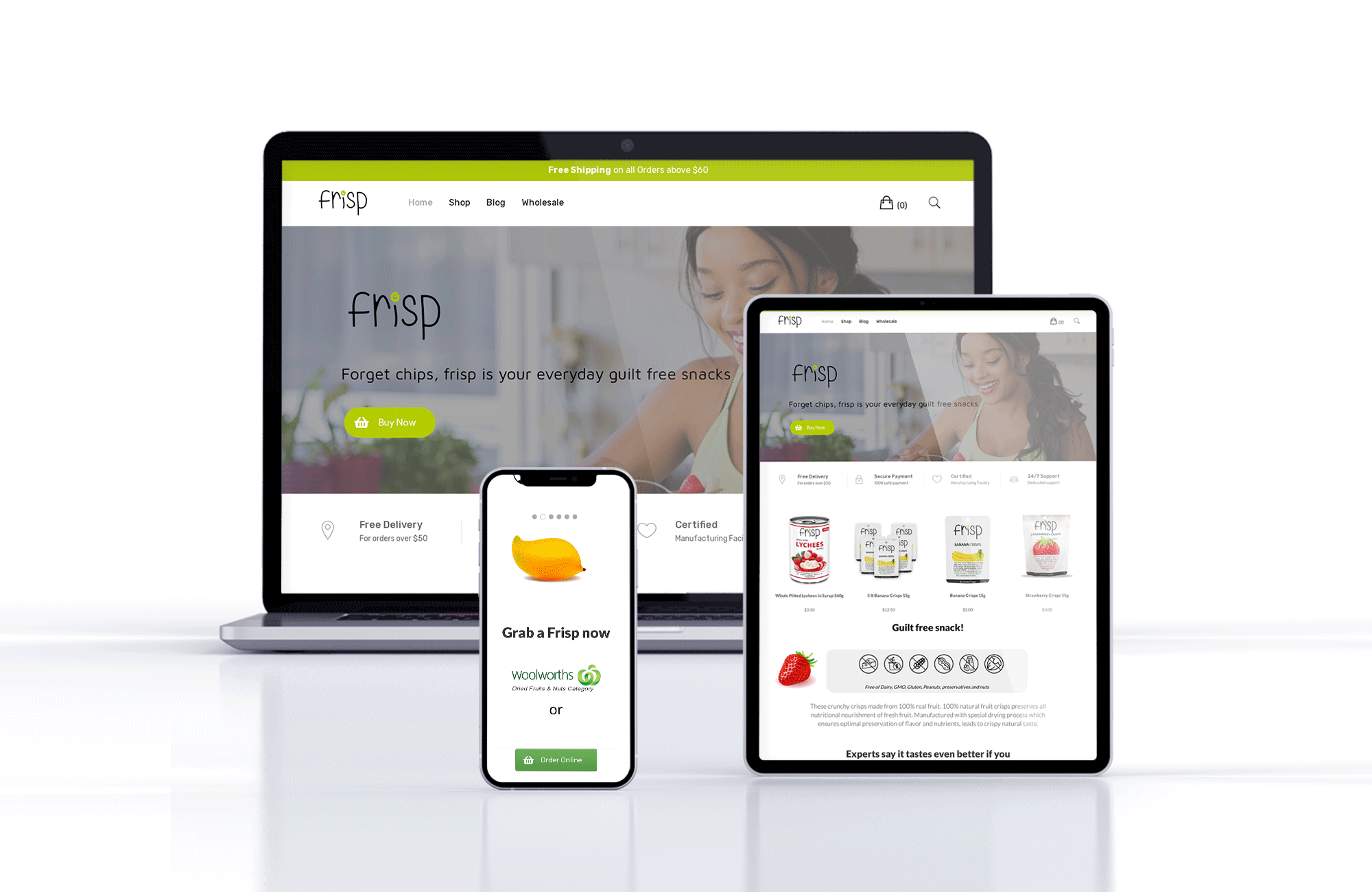
After several iterations and rounds of validation, we replaced the existing Frisp website. Implementation was done in WordPress, because the old site was built on WordPress and the platform was familiar to everyone at Frisp. There were a few hiccups during launch, but everything was fixed and the site is up and running. You can see the live implementation at frisp.com.au.
Results
According to the Frisp team, the rebrand yielded very positive results and increased sales. They decided to add more Frisp products to their range and are confident it will be a success.
Bounce rate was reported to have dropped drastically. We're yet to see exact numbers, but overall the rebranding project appears to be doing well.